By Rich Lowry
Syndicated Columnist
We live in an era of public ugliness, of architects who deliberately make their forms unsightly and inhuman, and of public art installations that are invariably ridiculous.The most obvious exception is the ballpark, which has gotten more beautiful rather than less in a great example of renewal through a return to tradition.
Paul Goldberger, a former architecture writer for The New York Times, traces this journey in his wonderful new book “Ballpark.”
He rightly calls the ballpark “one of the greatest of all American building types” and argues that “as much as the town square, the street, the park, and the plaza, the baseball park is a key part of American public space.”
Ballparks went from delightfully peculiar structures shoehorned into city streets, to monochromatic multiuse facilities with all the charm of public-works projects, before rediscovering the old forms.

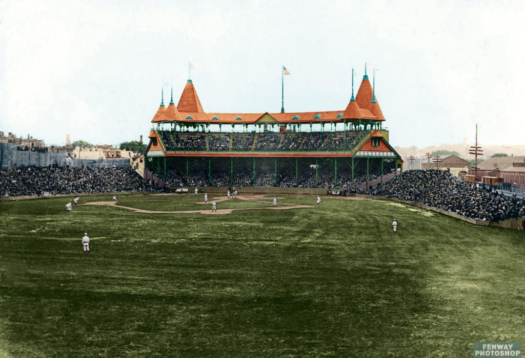
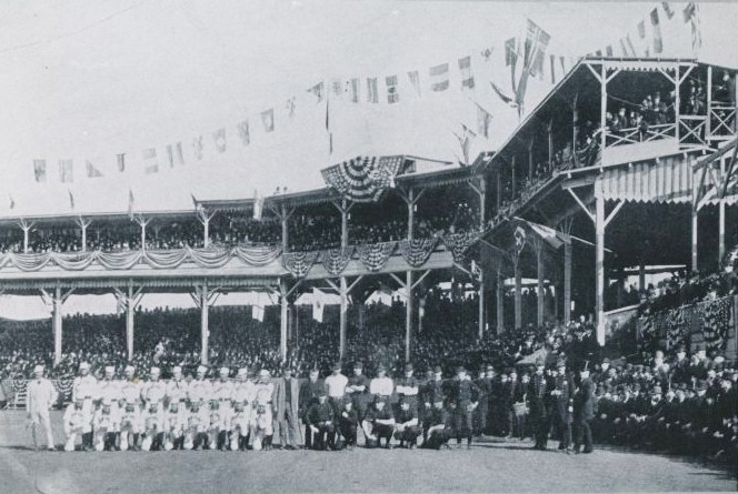
The first ballpark was built in Brooklyn in 1862 and called “Union Grounds.” Amazingly enough, “The Star-Spangled Banner,” not yet the national anthem, was played before the first game. The wooden parks of the 19th century tended to burn down, sometimes spectacularly (a fire at the South End Grounds in Boston took out 200 buildings in Roxbury).

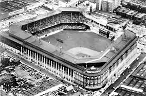
The 20th century brought the age of steel, brick and concrete, and “the Golden Age” of 1912-14. It gave us Crosley Field, where the Reds played until 1970, with an upward slope known as the “terrace” in left field; Tiger Stadium, quirky and cozy (a flagpole stood in the field of play in deep center); and especially the “jewel boxes” of Fenway, Wrigley and Ebbets.
Subsequent decades brought a flight from cities, and from idiosyncrasy. Cleveland previewed what was to come in the 1930s with its publicly funded, gargantuan, usually half-empty, symmetrical, multisport Municipal Stadium, or the “Mistake by the Lake.”
The truly dreadful, indistinguishable concrete doughnuts, made for football and baseball but manifestly unsuited for the latter, arrived beginning in the 1960s.
The turning point was Camden Yards in Baltimore, opened in 1992. Originally conceived as another multisport suburban facility, it instead decisively moved baseball beyond such hybrids. Camden Yards has a red-brick exterior and exposed steel supports inside, eschewing the concrete of the doughnuts. It limits foul territory to bring ground-level seats closer. The stands are arranged asymmetrically to avoid a deadening sameness, and frame a view of the Baltimore skyline, anchoring the park in the city.
It was such a triumph that its retro style has become a design cliche. Its influence stamped the best of the new parks: PNC Park in Pittsburgh, which, outside of Fenway and Wrigley, might be the most charming place to watch a game in the country; Oracle Park in San Francisco, which is everything its execrable forebear, Candlestick, wasn’t; T-Mobile Park in Seattle, which is enchanting despite a retractable roof.
Goldberger writes of how the ballpark, with its lush field at the center of an enclosure of concrete and steel, is the garden in the city, a sports combination of the Jeffersonian agrarian tradition and the Hamiltonian emphasis on cities and industry.
It’s a wonder we managed to mess it up, but we did, before the current revival that shows there’s always a way back.
Rich Lowry is editor of the National Review.
(c) 2019 by King Features Synd., Inc.